Tokopedia Minimalism
Hi everyone, today I made an attempt to redesign Tokopedia app into a much simple interface with minimalist design approach.
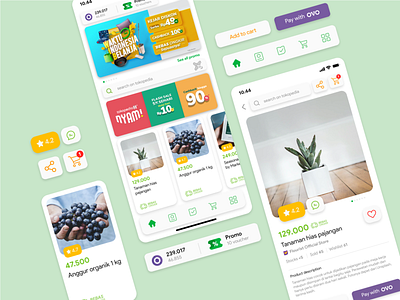
The main goals of this redesign are:
- Make the search bar easier to reach with one hand.
- Declutter the homepage so user can focus on what matters.
- Increasing the conversion of payment with OVO.
Execution:
- Search bar is supposed to be clicked while OVO and Voucher status is basically just an information at a glance, user will use it at the end of transaction process during checkout.
- The homepage will looks much cleaner if I moved icons of other Tokopedia products such as digital, tickers, etc into a single dedicated page, which is replacing the profile button on bottom right corner.
- In return, the profile button moved behind OVO and Voucher on the top right corner. User will find it easier to identify as their profile picture will show up there.
- On product display page, I replaced Beli Langsung with Pay with OVO button. However, user can still pay with other payment method or made a bulk order by tapping add to cart.
- If the user don't have sufficient OVO balance, then the button will only show Pay button instead Pay with OVO.
Disclaimer:
I don't have any data on how Tokopedia users interact with the app. All of this exploration is just based on my personal experience as a user. No user behavior data was applied to this design.
I think that's all. If you want to know more about how I made this redesign, feel free to reach me out thru esadhx on social media. Thank you! 😊
Redesigned on August 2020.