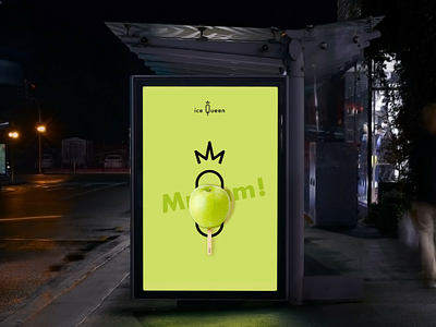
IceQueen's advertising | French and elegant sorbet brand
Advertising is an essential element if one wants to make oneself known in the eyes of all. This is why I used different media: the advertising spot and the advertising poster. For the advertising poster, I simply took the illustration of the packaging and added "Mmmm!" in the background to show the greedy aspect while keeping the values of chic and naturalness. It's an asset, because you can easily recognize the brand. If you see one of the posters on a street corner and you haven't had time to take a closer look at it, you can easily find the packagings on the shelves because they are similar. Then, for the TV spot, I put together several animations of my sorbets in order to highlight them and make them almost alive. These passages are cut by animations of the logo. At the beginning, we find the crown on the rhythm of the music, then the pictogram and the logo at the end. We almost have a story, because with each intervention, we see a little more on the logo and the brand, which creates continuity. In addition, the packaging is animated by the music, which makes the whole thing very dynamic. The keywords mentioned at the beginning appear as the advertising progresses. This constitutes "Natural, gourmet and chic sorbets!". ———————————————————— 🌐 My website : https://hurtikonn.wixsite.com/hurtikonngraphic
