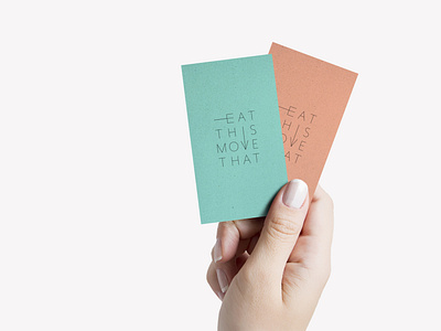
Eat This Move That
Smart and simple is always our goal. For this project we paired strong typography with an interesting color palette. The E becomes a fork, and the V becomes an arrow, both referencing the two prong focus of the business, food and physical fitness.
More by Rosa Pearson Design View profile
Like
