Nature Hype Network Logotype
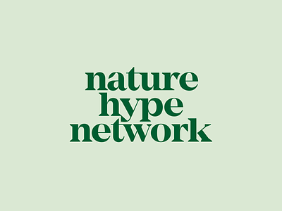
Here's a close up of Nature Hype Network's logotype.
NHN Is all about connection, so I worked in quite a few ligatures and really worked in connecting the letterforms. The founder's one request was that I incorporate a leaf into the letters, so I incorporated a subtle leaf in the "a".