Investment Strategy Web App
The team is available for new projects! Drop us a line: hello@purrweb.com | WhatsApp | Website
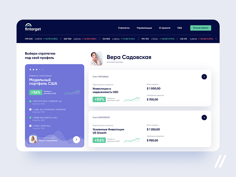
Howdy, guys? We like to face difficulties and never sidestep sophisticated projects. Happy to show you how we used UI/UX design to facilitate a financial tool that works like a store of investment strategies.
👩🏻💻 On the shot, you can see the user’s profile. That’s where the user can look at each strategy — because if you don’t want to waste money, you need to keep yourself in the picture — and link one to an account.
🗂The client had a guideline on design, so we tried to implement all recommendations: used light background, added violet to emphasize important elements, and didn’t shy away from shadows.
📈 Investment is complicated — that’s a fact. In order to simplify things for newbies, you need to put a financial tool in a super simple way. And we did it.
Created by Anastasia Martyan
Feedback helps us improve and grow, We’re keen to hear your thoughts! ❤️
PS We know to utilize UI/UX design to make users fall in love with a product. Check out how we used our skills to: - raise $400k as capital for startup - streamline cryptocurrency e-wallet - reboot a Real Estate startup - help newbies jump into investing - conquer the chef freelance market - simplify the life of event organizers And that's not all — you can find more case studies in our Blog! 💜
