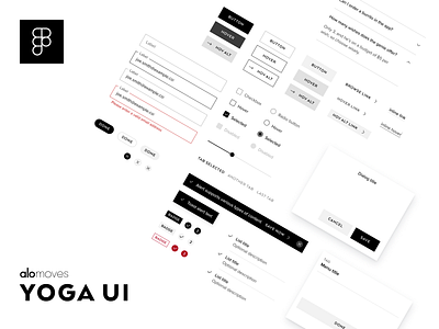
Yoga UI design system
Hey Dribbble! We're excited for Alo Moves to participate in the design community. There's a lot being redesigned and refactored on our website and app, but it starts here with the design system. Our brand identity is simple and sharp, using mostly black and white, so our design system reflects that.
These are some of the websites/brands we used as visual inspiration:
• brand.uber.com/brand-story
• room.com
• webflow.com/designer
• mammademin.com
• clippings.com
• bielkeyang.com
• dbsbank.design/index.html
• gbmhomebroker.com/trading.html
• bielkeyang.com
• rino-pelle.com
• avantaxwealthmanagement.com
• pollenlondon.com
Core styles and components in the design library are:
• Colors
• Icons
• Shadows
• Typography
• Accordions
• Alerts
• Avatars
• Badges
• Buttons
• Dialogs
• Dividers
• Inputs (fields, selectors, etc.)
• Menus
• Sliders
• Tabs


