Gap PDP Concept
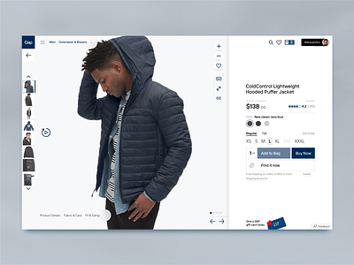


I keep thinking about how e-commerce product detail and list pages haven't changed much since they came of age in the 90s. It's time for us to use the canvas of the screen in cleaner, clearer and hopefully better ways. I made sure everything in this design and framework maps to the golden section.
There's something clean about the Gap photograph. An incredible number of their product shots line up incredibly well with the golden section.
And yes, I used that "new" logo from a few years back that everyone hated. :-D
