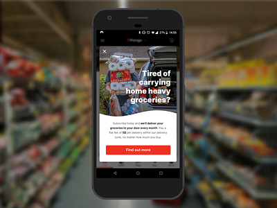
Daily UX Writing – Day 4: Grocery Promo
Day 4 of www.dailyuxwriting.com
Today's challenge was particularly tricky because this promotion may only apply to a certain portion of users seeing it (eg. the flat fee may increase or the service isn't available if you live too far away, or conversely if you live right next door you shop more frequently and don't get huge grocery loads that will need delivery). Phrasing the offer extremely clearly meant that users wouldn't be tricked into clicking something that didn't apply to them, which can be frustrating! The image and header text aim to evoke a pain point that users will be familiar with, making them more likely to pay attention to what we are offering to ease that pain point for them.
Scenario: A user is in their favorite supermarket. They open the supermarket’s app on their phone to see what’s on sale and are greeted by a promotion.
Challenge: Write a promotional home screen for a subscription service that delivers groceries to the user once-a-month for a flat fee.
Headline: 45 characters max
Body: 175 characters max
Button(s): 25 characters max
