Logo design
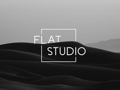
We present the logo designed for own web studio
When creating our logo, we tried to use the minimum number of elements, as we adhere to minimalism.
Our design was based on a simple square shape. Since a square is: organization, punctuality, analytical thinking, attention to detail, accuracy, rationality, rationality, practicality, economy, persistence, firmness in decisions, patience, hard work, strict adherence to the rules, but since we go beyond the boundaries of the square, we show that these rules are conditional.
Why white?
The key concept in the perception of white is purity and perfection. This is a color that cannot hide and conceal anything in itself, apparently, therefore, there is always confidence in everything that has such a color.
Our main idea was to show you that you cannot limit yourself to some kind of framework and standards and you need to go beyond them. This logo stands out for its simplicity and ease of perception.
To some extent, this logo conveys our views on how modern design should look.
