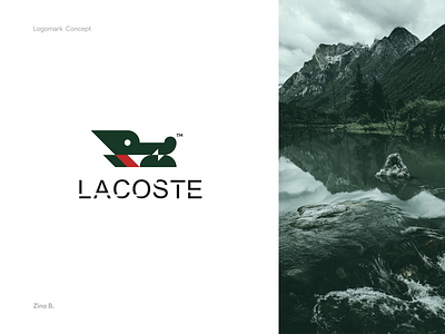
Lacoste bran identity
I always wanted to rebrand Lacoste but never got the time to do it.
This is my take on their brand identity using my 3 shapes secret method in logo design which you can find here https://bit.ly/3226019
I have decided not to use the entire crocodile’s 🐊 body, the head should be enough to convey the feeling
Notice there are a lot of triangles and sharp edges but they are contrasted with that funny look in the crocodile’s eyes 😁
Which one do you like?
Hit "L" if you like this
👉follow me on Instagram for more behind the scenes stuff @zinobelkaddas👈
More by Zino Belkaddas View profile
Like


