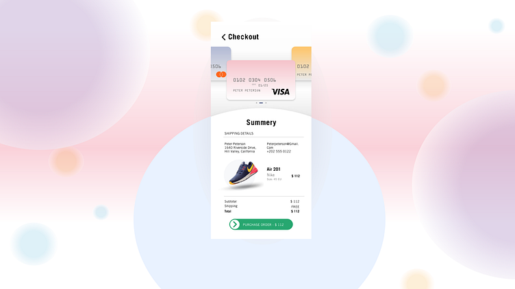
NIKE CHECKOUT
This is day 002 of daily ui challenges. I had to create a sign out for this challenge. In my work i have used Nike as an example. I tried to keep it moderen and create some depth into the solutions. I used white to make the most importent elements in the design pop up. I used Nikes own font, and a font for the cards.
More by Rikke Frederiksen View profile
Like
