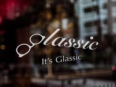
Glassic: It’s Glassic
Glassic is a brand new glasses company for young people. The company image is about modern minimalism with a touch of European style. The contrast among red, white and black symbolizes the passion of youngsters; while simple white designs reflect a refined and courteous character of hipsters.
This design has coordinated a series of branding plans. A consistent image of Glassic is built among different categories, making the Glassic style stand out, which ranges from creating the company name, logo, signage and icons, to designing business cards, leaflets, paper bags, advertisements, website, etc.
Another feature of Glassic is the spirit of customer first. In the design of staff badges, general staff titles are replaced with a more customer-friendly set. The company website and mobile application are designed with a UI/UX interface that makes shopping easier. The slogans used in the very first advertising campaign are “bring your beauty out (for female)” and “bring your style out (for male)” in English, which shows that Glassic values customers’ images more that the functions and features of the glasses.
Target: Glassic
D: Tony Sin
Daydream Project: This project is an imaginary work developed from my personal interests
Branding, Advertising, Packaging, Applications
2019
Copyright © 2020 mrsindesign. All rights reserved.
________________________________________________
EXCLUSIVE CONTENTS
Patreon: https://www.patreon.com/mrsindesign
ShutterStock: https://www.shutterstock.com/g/mrsindesign
FOLLOW ME
Instagram: https://www.instagram.com/mrsindesign
Facebook: https://www.facebook.com/mrsindesign
Twitter: https://twitter.com/mrsindesign
Behance: https://www.behance.net/mrsindesign


