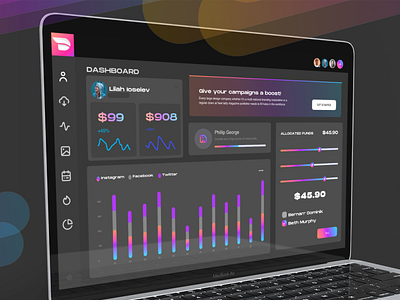
Dark Diginomaly Dashboard - Concept exploration in Webflow
Just tying out the latest feature additions and updates to the @Webflow platform. I sure am having fun with the new clipping ability for gradient styles applied-to-text, plus many more feature enhancements.
This shot highlights a dark-mode dashboard design concept for Diginomaly, and it includes a few common business dashboard component examples like recent sales and campaign metrics.
I'll admit, it’s a real joy creating live high-fi sites (in minutes) thanks to innovative breakthroughs in multiple web technologies and constant streams of UX improvements to many of the 'no code' platform, (especially @Webflow). One of the most impressive feats of all is the organized information architecture, and also the ability to semantically manage global styles with ease… Finally!
It's almost as-if the #nocode movement is a brilliantly crafted tech disruptor quietly tip-toeing it's way into some of the largest global corporations to offer next-level modular benefits, cost-savings and overall flexibility, today.
There's no question I'm excited for what's to come in 2020~ Thanks for stopping by, and stay safe all!
