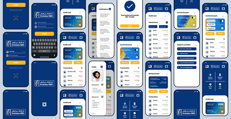
Emirates NBD redesign
I always had a knack for UI design but never knew the secrets of the trade, from color theory to type scales and using grids efficiently, but I’ve always been able to challenge a product design critically using my strong UX experience.
Being unemployed and through a global lockdown, I finally had the time to learn the ropes of the craft and to apply what I learned, I took the liberty to redesign Emirates NBD personal banking app as a personal project.
I did user interviews with some Emirates NBD users, and I figured that although they like the app, there’s a huge room for improvement, the main request was to have the most used features front and center (i.e. settle card, make a payment, check latest transactions, or check balance) banking apps are classified as Productivity apps, and one of its main metrics is to to get the job done and close the app as soon as possible contrary to entertainment apps.
Kudos to Figma, I never thought the tool is that easy to pick up and get things done.
Disclaimer: I don’t represent Emirates NBD by any mean possible nor do I have data from the bank to base the redesign upon
