Car Rental App Design Concept
💌 Have a project idea? We are available for new projects info@ronasit.com | Telegram | Facebook | Linkedin | Website
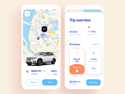
This is an app for people who want to rent a car for quotidian rides. It instantly provides users with the most convenient options.
This Dribbble shot features a renting flow. The first screen shows a map with nearby cars and cards with available types of vehicles. Ride details - time, distance, price - are shown on the second screen.
Having analyzed popular car rental apps, we've found that a map is a very important element of this kind of apps. Based on this, we've chosen a light color palette not to distract users from what matters most to them. We've also used the effects of neumorphism (design trend of 2020) on car cards for better usability - it makes it obvious for a user that a card is tappable.
What are the cool features of this app? There are lots of them! Ability to view parking lots, a route to a chosen car, and the time it will take to reach it. Quick choice of a vehicle... and did we mention an ability to review past rides and road trips? This is a great way to keep track of your movements.


