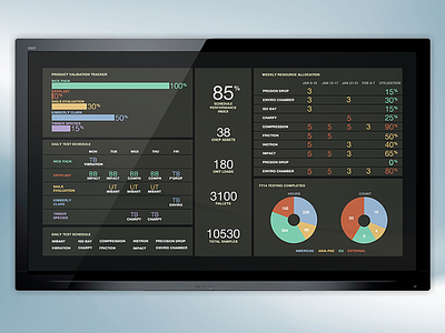
Dark Dashboard Concept
Have been playing around with a few colour variations to see what works best. Am liking the way this dark version has turned out. This is still a work in progress so I know a few things aren't perfect yet.
More by Justin Roberts View profile
Like
