Clear Score UI Credit App
Designing an easier way to break down your credit usage. (Clear Score re-design)
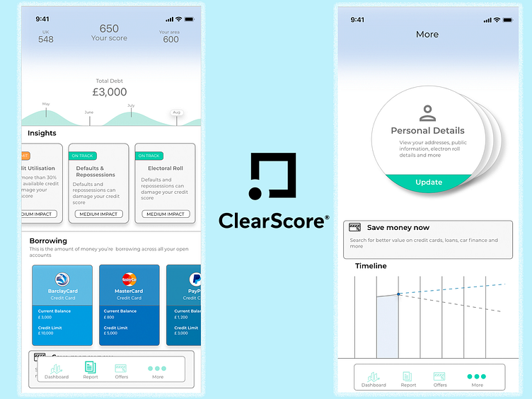
The screen on the left allows the user to know their score and total debt; also allowing them to compare in their area and country. The screen also allows the user to understand where debt is coming from and ways to improve their credit score and reduce their debt.
Screen on the right reduces page clutter, enough white space for a clean ui.
More by Yoann Muya View profile
Like
