DailyUI #051 - Press Page
Good' evening Dribbblers 👋
This is my #051 #DailyUI design. 🌲🦁🍃
Design Hint 💻
Create a Press Page. Think about who you are representing and what important information you should convey. Is it for a new startup? A huge global brand? A non-profit organization? Or a small local business? Or is it actually for a person such as a celebrity, athlete, politician, etc.?
The Idea 💡
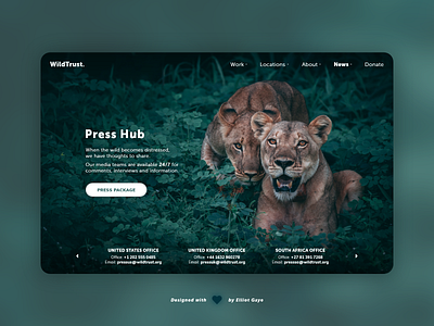
The idea for todays UI design is a web 'press' page for a theoretical non-profit organisation, called WildTurst. The page will feature a top navigation bar that allows for global site navigation, a 'press package' button that allows the user to download a press kit and various other snippets of information to do with press coverage contact. The design will feature prominent photography, a clean font selection and an overall sleek and modern layout.
Final Thoughts 🧠
I'm in love with my design today! It's extremely sleek and modern, all while being user-friendly and easy to navigate, it has all the information and UI elements this type of UI needs.
The page consists of a top aligned navigational bar that allows the user to navigate through the entire website and to donate freely at any time. What the user will first see when loading up the page is the 'prominent' and beautiful photographic background, along with the page's title, 'Press Hub'. Underneath the title is a couple of paragraphs explaining what the page is about and how the non-profit's press contact strategy works. Underneath the paragraphs is a 'press package' button allowing the user to download a press kit for the organisation, this would include information such as images, articles, current projects, charity work and social media links. Finally, various bottom aligned organisational contact information finishes off the design, here the user can view each WildTrust office's mobile and email contact details, for each of the offices they have located around the globe; this is followed by a carousel navigation using buttons either side, for easy navigation.
Overall, I have really enjoyed designing today's UI, and I love the final result I have created; it's modern, sleek and aesthetically pleasing, just what I wanted it to be. I think the overall UI really pops with the selected photographic background, it is the perfect fit for what I wanted to achieve with today's UI, kudos to the photographer (credits below), he really nailed the shot.
Unsplash photo credits 📷
@gerandeklerk
Share the love, press "L" or "F" if you ❤️ my work!
As always, I welcome any feedback! 😄
- Elliot
