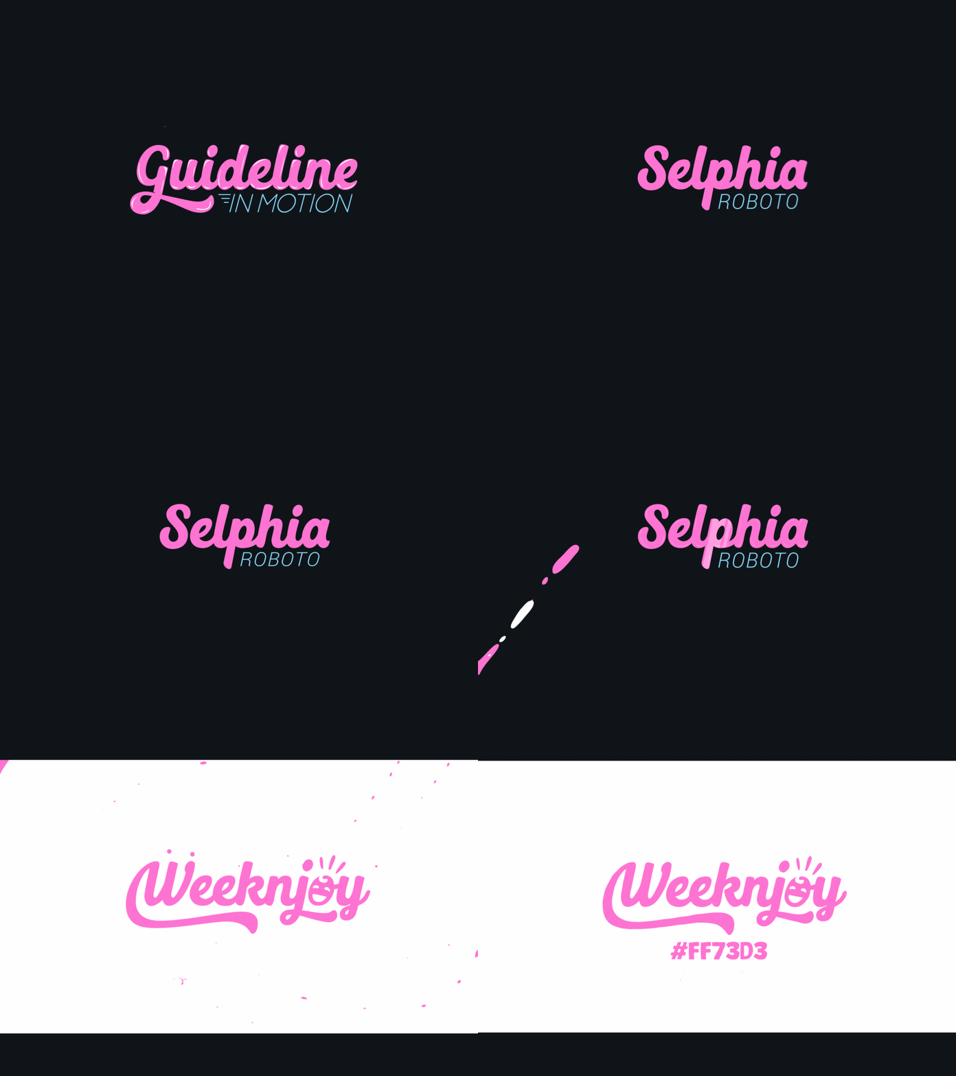
WeeknJoy Branding concept | Fluid transition
Hello everyone! Here's my final showcase for one of my previous branding projects - WeeknJoy. This time it's an experimental fluid transition between 2 sections: Typography and Color palletes. The logo animation helps attracting children's attention while browsing the Web with its fast pace, fluid movements and bright color palettes. Check out part 1 & 2:
p1: https://dribbble.com/shots/13945043-WeeknJoy-Branding-concept-Logo-animation
p2: https://dribbble.com/shots/13972032-WeeknJoy-Branding-concept-Logo-transition
Feel free to comment and give feedback. Hit "Like" If you like the concept. I really appreciate it !
More by Bảo Duy View profile
Like
