DailyUI #050 - Job Listing
Good' evening Dribbblers 👋
This is my #050 #DailyUI design. 💼👨💼✨
Design Hint 💻
No design hint today... 😔 Where are these disappearing off to? 😅
The Idea 💡
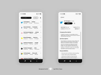
The idea for todays UI design is a job listing board platform app for Android and iOS. The app will feature a clean and easy to navigate UI, with a simple job board consisting of various current listed jobs, deep search functionality, sorting functionality, alerts, bookmarks and a bottom 'navbar' for global application navigation. The app's design will consist of a black and white monochromatic colour palette, fitting a spacious, clean and minimal overall aesthetic.
Final Thoughts 🧠
It's user-friendly, super clean and minimal! My job listing DailyUI has come off as a treat.
The job board screen [LEFT] displays all the current job listings on the platform. Here the user can either search for a job (by title, keyword or company) using the search box, sort the current board (by newest, alphabetical or distance) using the sort function and get alerts for the current search criteria using the notification bell. Each job listing has it's own dedicated icon to show of the company ad, a prominent title of the job occupation along with the the company name, three snippets of vital information about the job, including the date the ad was posted, the job contract and the location of the job, and a triple-dot button that allows for easy application applying straight from the board, along with the ability to bookmark/save the listing for future reading.
The dedicated job ad screen [RIGHT] displays all the information about a single job advert/listing all in one place, on a single, easy to read screen. Here the user can apply with a single tap via the recognisable 'apply' button located just under the job occupation title, along with the ability to bookmark/save the ad/listing for a future date. Underneath the button lies 'vital snippet' information such as the date the ad was posted, job contract type, job location and how many current applicants have applied to the job. Underneath the snippets lies the rest of the job ad/listing information such as the company and job description, responsibilities, requirements and benefits; all displayed in spaciously neat, organised manner along with a viewable scrollbar to make navigation easier.
Overall, it's been a super duper day of designing my 50th DailyUI. Through the concept and wireframing stages to the final prototypes, I've really enjoyed designing today's UI, and I love what I've ended with!
50th DailyUI Retrospective ✒️
I'm halfway through! It feels great to be at this stage of the challenge. Looking back at my 49 previous UIs over the past 2 and half months, I can say that I've learnt further about user experience and user interface design, and the steps, principles and practices that lead to creating fabulous and user-centred UIs, all while keeping up and researching about current trends. I'll be starting back at University again soon, I'll try to keep up with the DailyUIs, but University comes first. It's been a fun and insightful journey creating these past 50 UIs, let us hope the next 50 are just as fun!
Share the love, press "L" or "F" if you ❤️ my work!
As always, I welcome any feedback! 😄
- Elliot
