ezzzy co brand
A contest holder asked to make a logo for a real estate searching portal. As i expected, almost everyone make logo(s) with shapes of house or buiding.
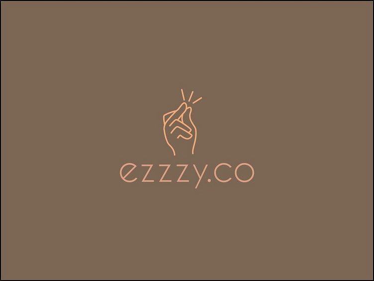
I was thinking about going out-of-the-box option and suddenly it hit me that ezzzy sounds like easy, and when i looked for inspiration, i found that snapping finger seemed like a good logo (as easy as snapping a finger!), and i think i success! What do you think?
This is also the first i try the color scheme collection, and suprisingly the result is not bad. I still have to learn on how to imagine if i used a color schemed how will the final result will be....
Feedback are welcome!