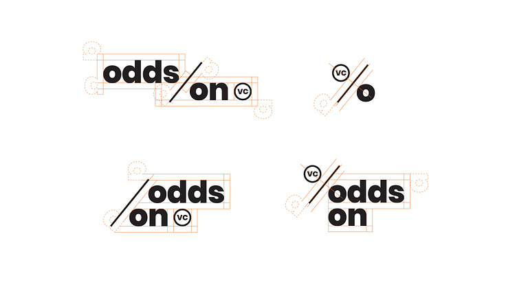
Odds On VC logo set and logo grid
The Logo: We couldn’t miss the opportunity to turn the Os in Odds On into a percentage symbol. The icon reflects Odds On’s mission to bet on first-time founders and their bold ideas, upping their odds of achieving success and making their stamp on the world.
The logo elements are variable depending on the use case and orientation.
The typeface used for the words mark is Poppins, designed by Jonny Pinhorn and Ninad Kale.
See the full case study at the link below! https://hoodzpahdesign.com/portfolio/odds-on-vc-brand-identity/
More by Hoodzpah View profile
Like
