IceQueen's packagings | French and elegant sorbet.
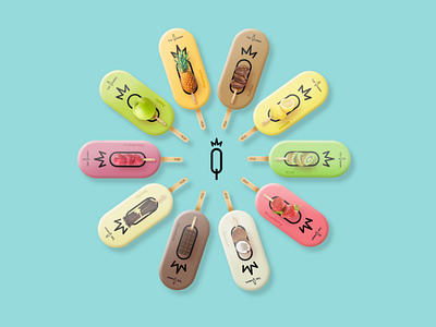
Packaging is usually the first interaction between the customer and the brand. If the latter is qualitative, beautiful, attractive and above all stands out from the others by its shape, color, texture and much more will draw attention to it. Ice Queen needed a real identity that brings out its character traits: chic, natural and gourmet. I based myself on these keywords to create these packagings below. They stand out for the completely new and original shape of this range of 10 fragrances. The shape is not insignificant, since it echoes the lines of the logo for a better appropriation and recognition of the brand. The shape is reminiscent of a softness with its rounded edges, and a practicality with the stick out of the way to better hold your sorbet. The packaging is designed to be opened from the side thanks to a small notch that allows an easy and very elegant opening (like a case, so it is here that we find the royal and distinguished aspect). The graphic design on the packaging is also very revealing of the three keywords of Ice Queen. The chic aspect comes through the sobriety and simplicity of the whole packaging. In addition, the logo in the background is inlaid on the illustration stick to evoke the Ice Queen pictogram. The naturalness, thanks to the fruit represented on an ice cream stick, is intended to show what the sorbet contains, that means fruit from organic farming. And the greediness is expressed by the universe and the tone on tone of the colors in relation to the ingredients presented. The whole forms a sober, new packaging, and above all in correlation with the image that Ice Queen wishes to reflect. ———————————————————— 🌐 My website : https://hurtikonn.wixsite.com/hurtikonngraphic
