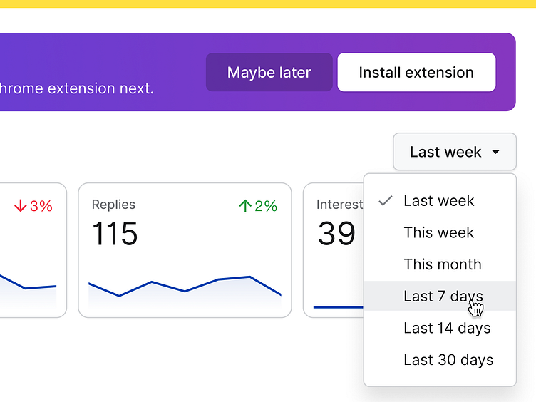
Colors, shadows, and type, oh my!
Some fun explorations for our new overview page on Gem.com.
I'm playing with long, soft shadows, coherent type styles, vibrant colors, and a blend of corner radii to create a compact but approachable UI.
Can't wait to share more once we dial this in over the coming weeks!
As we work on introducing a new color palette
More by Tanner Christensen View profile
Like
