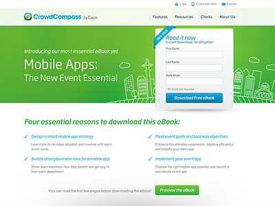
CrowdCompass Landing Page
Just a simple landing page layout for an eBook download. I liked the balance of colors. Content is a little boring, but felt it kept the form eye-catching (and thus a conversion-focused).
We let users preview the eBook on the page, which was a first.
See it in action here: http://www.crowdcompass.com/mobile-apps-the-new-event-essential-ebook.shtml
More by Matt Richards View profile
Like
