Portfolio redesign, again.
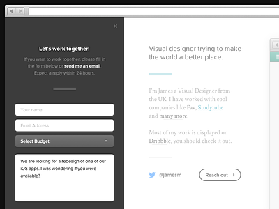
So, i've decided I want to redesign my portfolio again. This time i've went for something a little simpler. Hoping to have this developed in the near future. I like the simple direction.
PS- Also, you're probably wondering, is the white section to the right a little faded? Yes is your answer. Just when the 'Reach out' button is clicked, that section will fade slightly to focus the user on the slide-out panel to the left. — Ideas & suggestions welcome. :)
I've also attached two attachments you should check out ;)
More by James View profile
Services by James
Like


