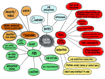
Design Artifacts — Mind Mapping
Bonjour!
Today, I'm shifting gears a bit to share something that isn't a UI design but is just as crucial—a mind map for a Job Tracker web application. Think of it as the skeleton of every great design endeavor. In this color-coded neural network of creativity, I've mapped out ideas and strategies to set the stage for an intuitive, user-friendly interface. Whether you're in the brainstorming phase or you're knee-deep in wireframing, a well-thought-out mind map like this one can be your north star. It organizes your thoughts, prioritizes your tasks, and can even spawn those 'a-ha' moments that every designer lives for.
Rant begins here:
Bear with me for a minute. I've seen other designers jumping into Photoshop, Sketch or Figma way, way too fast when solving a problem. You should try getting familiar with the problem you are facing before starting to design the interface or push pixels into a canvas. Try to create a conceptual model of the problem or idea that you have. Divorce yourself from the executional side of product design in the early stages of a project.
Mind maps are a great visual tool that can help you generate new ideas, brainstorm, and find new connections. You will organize your thoughts more productively, and is amazing when you finally see a bunch of nodes coming from an initial concept and how they all correlate and work together.
On a side note: remember that all the artifacts you produce for any particular project represent your design process. When your team members gather around project artifacts with the intention of iteratively improving a solution over time, they create a common language.
That's all folks, this rant on UX design is over. Follow me if you want to see more of my work, and hit that 'L' if you appreciate the planning that goes into turning ideas into digital realities.
Cheers!

