DailyUI #048 – Coming Soon
Good' evening Dribbblers 👋
This is my #048 #DailyUI design. 🚀⏲️🤖
Design Hint 💻
No design hint today... 😔 Where are these disappearing off to? 😅
The Idea 💡
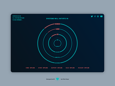
The idea for today’s UI design is a coming soon page as part of a theoretical undisclosed dedicated video game website. The page will feature a prominent countdown timer, various social media buttons, and various other pieces of text to emphasise the genre of the game. The design will feature various sci-fi elements such as gradients, semi-transparent shadow text, shapes and will encompass a futuristic Red and Blue colour palette. The font type will also be carefully chosen to fit the specific game genre.
Final Thoughts 🧠
It’s futuristic! It’s genre-specific! It’s fun! All the qualities I wanted it to have. Got to say, I am more than pleased with how today’s DailyUI turned out! Inspired by pre-existing sci-fi games, such as Stellaris and Star Citizen, I have achieved a brilliantly unique and pleasantly experienced futuristic/sci-fi UI.
Once the user loads the page up, they are first greeted to a huge sci-fi-esqe countdown timer which rotates as the days, hours, minutes and seconds tick along. Speaking of time, the countdown displays each of these time figures as whole converted timed intervals (e.g. displayed is 23 hours left, converted this would be 1380 minutes and 82800 second) rather than the ordinary timer where it goes from 60 X to 0 X then resets and jumps back up to 60 X again. The timer ‘hand/s’ rotates/completes-its-cycle, changing colour from Red to Blue (colour theory), indicating the completion, kind of like an ordinary timer, but with its own jazz. I put a lot of thought into the design and aesthetic for this countdown timer, since it was literally the biggest and most important element on the page. I had a solid plan going in, but it did get amended and iterated upon a fair few times, just to get it right.
While the countdown is the primary focus of the UI, the rest of the UI elements displayed are there to guide and aid the user through the page and to give explanation to what they [user] have stumbled across. They also help with aiding the aesthetical execution of the overall UI, creating a more refined and pleasant looking UI. The Blue ‘title’ text located at the centre-top of the page explains to some degree what the countdown timer is for and along with the centre-bottom, Red (colour theory) ‘offline page’ buttons, gives a hint to the user on what happens when the countdown finishes; systems initiate/start-up and pages start to turn online/accessible. The top-right social media icon button elements are displayed to give the user something to do while they wait; view and socialise with the developers and with the wider gaming audience, this also neatly unifies and symmetrises the entire UI. Finally, to finish of the aesthetic I created some semi-transparent shadow text that sat underneath all the text elements to simulate the feeling of the text hovering out of the screen, kind of like a hologram, along with extra circles located in the centre of the design to complete this feeling.
Overall, I am over the moon with my design today! It’s certainly one of the most creative UIs I have accomplished during my DailyUI challenge so far. I really think I’ve pulled the design off, both aesthetically and appropriately for the end user experience, in an upmost unique way!
Share the love, press "L" or "F" if you ❤️ my work!
As always, I welcome any feedback! 😄
- Elliot
Share the love, press "L" or "F" if you ❤️ my work!
As always, I welcome any feedback! 😄
- Elliot
