Logo Rebrand
client: IROCK Crushers
IROCK designs & manufactures portable rock crushing plants. Internally, even longtime employees thought their original logo was a tall, yellow mountain peak, reminiscent of the Alps in Europe. But really, the three triangles were supposed to be conical rock piles, symbolizing the final product their machines produce.
The dated logo needed a makeover. Instead of a completely new identity, a modernized evolution of the logo made the most sense, keeping some of the visual history of IROCK intact. A modular mark with horizontal & vertical variants was key for the new identity in a digital world.
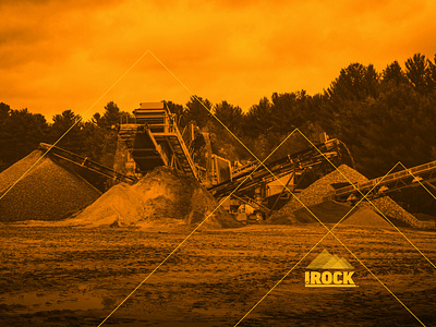
The yellow icon now uses three perfect right triangles, much more complementary to the geometry of an actual conical pile of rock. Lighter values of yellow add depth to a simple 2D mark. The slab serif typography was updated with a heavier sans serif face. Another small right triangle underscores the "i" as a hinted logo connection to IROCK's parent company, Ohio CAT. In select visual instances, a transparent version of the icon can be used over engaging photography.


