DailyUI #047 - Activity Feed
Good' afternoon Dribbblers 👋
This is my #047 #DailyUI design. 👍❤️💬
Design Hint 💻
No design hint today... 😔 Where are these disappearing off to? 😅
The Idea 💡
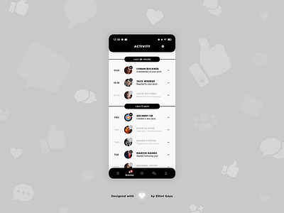
The idea for todays UI design is an activity feed screen as part of my Archery Community social media app for Android and iOS I have been designing for, since the start of my DailyUI Journey. The screen will feature various network activities such as, comments, messages, friend requests, tags, followers etc; the type of activities you'd find in an ordinary social media network. The design will be heavily based of off my previous #006, #013, #019, #023 DailyUIs, to connect all my screens I have previously designed in relation to one another, with a uniquely white-spaced 'banner' aesthetic and a black and white, monochromatic colour palette.
Final Thoughts 🧠
I love it! Definitely one of my favourite UIs I have designed so far. It's just that 'banner' aesthetic; it just gives the design that extra bit of uniqueness. Along with the white-space, the combination of legible and great looking fonts, and fun iconography, makes for a unique, interesting and fun-to-use activity feed experience.
The user would locate the activity feed with the help of the main 'navbar' at the bottom of the screen, that allows for full 'global' app navigation. Once the user is on the activity feed screen, they will see all their network activities related to their account, as a list, ordered from top to bottom - new to old. The unique 'banner' design materializes as 'time sections', cutting up the screen into various timed intervals (e.g. last 24 hours, last 7 days, last 14 days, last month etc.) to order the list and make the experience more clear. The user can also see how many activity notifications they have, by simply glancing at the bottom 'navbar' with the numbered red alert icon.
Each activity within the list will either be fully opaque if the user hasn't tapped/viewed the activity yet, OR semi-transparent if the user has tapped/viewed the activity previously. As part of a certain activity, the time the activity happened starts of the listed activity element, with a profile picture of the user that alerted the activity following, along with an iconographic icon displaying what type of activity it is to further aid the user experience. The user's name and the actual activity follows, with a triple-dot button ending off the element, allowing for a varied options menu, to delete the activity off the list etc.
Overall, its been a chill morning/afternoon of designing my activity feed screen. It feels really good seeing my Archery Community app take it's form! I'm chuffed with what I have achieved today.
Unsplash photo credits 📷
@heftiba, @luthermeb, @aiony, @mikailduran, @zulmaury, @davidhurley, @sirioberati
Share the love, press "L" or "F" if you ❤️ my work!
As always, I welcome any feedback! 😄
- Elliot
