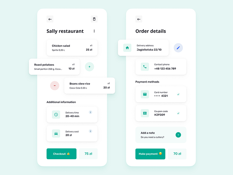
Food Delivery App - Order Screens
Hello there!👋
Market for food delivery 🚚 rising fast as never before. I noticed that, from my own perspective. I order food to home more than ever before. I'm using Glovo app to order food in my town. So, I decided I'll try to improve some aspects of the app as part of the practice. I've chosen to concentrate on the ordering section.
The first issue I have identified is the prioritization of information and the inefficient presentation of information. There are so many fields to fill in that can be overwhelming for a lot of users.
I've focused on making it more readable and easier to use. The information is now split into two screens: the order and payment screens. The division of screens allowed information to be better readable. I was also trying to simplify the visual design.
What do you think about it, how do you like it? Are you ordering food home more often now, too? What applications are you using?
If you like it just click "L" on keyboard. 🧡
Stay safe! 🙏
