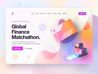
FinTech Website Hero Concept
Hey Dribbble,
I recently experimented with a different styling then I typically go with in attempt to see what I could make of this new light gradient trend that I'm actually a fan of.
I'm a fan because I feel like it puts a lot more emphasis on the content and less on the high contrast colorful images or background, which is always good to getting straight to the point.
This is just a website hero attempt for now.
Hope you enjoy,
Alex
-----
Interested in working for Caviar?
eatcaviar.co
Enjoy,
Alex
More by Alex Banaga View profile
Like
