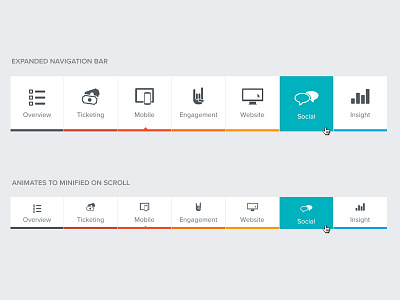
CrowdTorch Features Navigation
We have six main components of the CrowdTorch platform that have unique colors and icons. But how to treat the navigation? The splash of color along the bottoms, with a pleasant hover effect animation, creates a very clean navigation interface, while being slightly playful and fun.
Additionally, when you scroll down the page, it compacts into a minified version to take up less screen space. Also: a small arrow points you to the current page you are on, to help give you a sense of progress throughout the Tour section.
Check it out in action! http://www.crowdtorch.com/features/
More by Matt Richards View profile
Like
