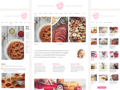
Dashing Dish Site V2
I went back to the drawing board after my last version. I felt like the previous version strayed too far from what we've been doing and what has been so successful.
This new design is an update in style and get's rid of the unnecessary fluff. Just clean, to the point, and focuses on the content.
Welcome to any feedback, the bigger versions attached.
More by Sean Farrell View profile
Like


