Logo Rebrand


client: Complete Hydraulic / Diesel Component Service
Complete Hydraulic needed a new logo after 25 years. They also had a sister company which they were renaming Complete Diesel. They needed a single logo mark to unify the two. Each company needed to stand alone, as well as together, depending on the business circumstance.
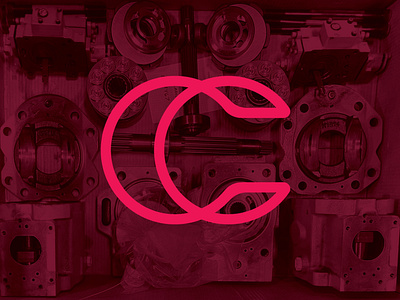
Hydraulics are long cylinders with hollow components and lubricated with oil. Diesel engines have hundreds of components, with serpentine belts and circular pulleys often as focal points.
These component shapes inspired the CC logo mark, and also alludes to both Complete companies interlocked as one. The CC icon has has some intentionally hidden features including the shape of a hydraulic eyelet, a serpentine belt wrapped around a pulley, and the illusion of a 3-dimensional cylinder viewable from a left or right vantage. If you were able to see those hidden images in the Magic Eye books that were popular in the 90’s, you’ll see it from both angles!
The font is Eurostile, which ties into the logo typography used by Complete’s parent company, Ohio CAT.
A pandemic put this rebrand on the back burner, but it’s still warming in the oven for a later time.