DailyUI #046 - Invoice
Good' evening Dribbblers 👋
This is my #046 #DailyUI design. 🧾📑📜
Design Hint 💻 No design hint today... I assume to design something to do with a invoice/check/bill.
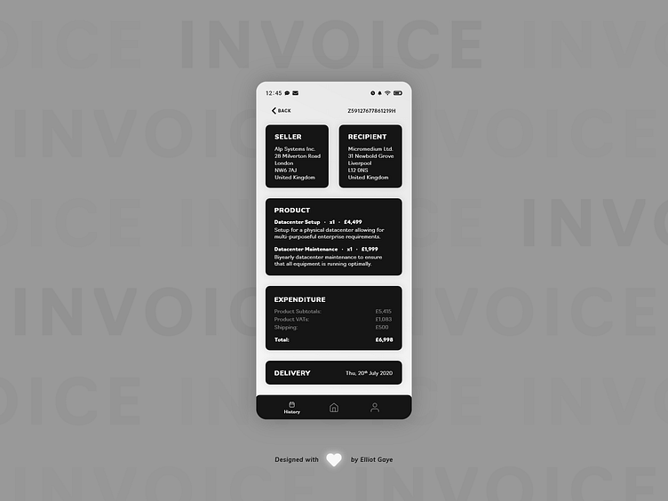
The Idea 💡 The idea for today’s UI design is a 'past invoice' screen, as part of a dedicated invoicing app for Android and iOS. The screen will feature all the pivotal information regarding an invoice, such as the seller info, recipient info, product info, expenditure info and dates. The screen will feature a predominantly text-only, card aesthetic with each piece of information located within its own card within the UI, followed by a black and white monochromatic colour palette.
Final Thoughts 🧠 It's minimal and informational; just what I was aiming to achieve for this DailyUI. I think the simple text-only nature of this UI is what makes it special and unique, the user can gain all the vital information about a past purchase from a single glance at their mobile screen.
What the user would first see is the invoice ID, located at the top right of the screen, to indicate what invoice they are viewing, but also for the informational aspect as well. They would then see their own address as well as the recipient's address located just below the invoice ID. Below the address' is the product/s that was being dealt with, along with a small, but descriptive description of the product/s at hand. Below the product card lies the expenditure card detailing the product/s subtotal, VAT and shipping costs, along with a total value/price for the end purchase. Finally, a delivery card finishes of the screen with a simple day/month/year date. The app also makes use of a 'navbar' allowing for fully-'global' application navigation.
Overall, it's been a pretty simple and chilled out day of designing my invoice UI. I like how I went about designing today's DailyUI, just as much as I like the final piece.
Share the love, press "L" or "F" if you ❤️ my work!
As always, I welcome any feedback! 😄
- Elliot
