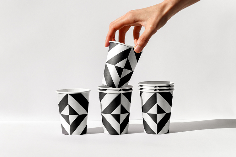
Counterpart cups
Counterpart’s brand identity blends Eastside LA urban coolness with an organic, homey neighborhood cafe feel. We used a simple black and white color palette and minimalistic layouts to counterbalance the colorful, vibrant restaurant space and menu items. We designed a custom pattern inspired by the unique tile in the restaurant, and hand-drawn illustrations using a human, natural, and imperfect style meant to align with the brand’s neighborhood feel and the organic, natural ingredients used on the menu.
More by Asís. View profile
Like
