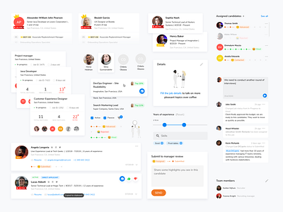
Design system for recruitment SaaS app
Inconsistency in design, mixed styles, mixed libraries, chaos perceived by users are common problems for Saas applications. Reuseful components significantly speed up the development of new features, but you can't handle them without setup of design patterns first.
To get both the product team and devs on the same page, I built a starting point for a design system for machine learning recruitment platform. I reviewed existing components, group them, unify and redesign.
Results
# Fixed usability issues
# Updated old-fashion corporate visual appearance
# Reduced the number of styles and components
# Components adjusted to the Angular Material library
# Finally, the mobile version of the app - created mobile-first based on the old desktop solutions
# For new features, it decreased the time spent on front-end development
