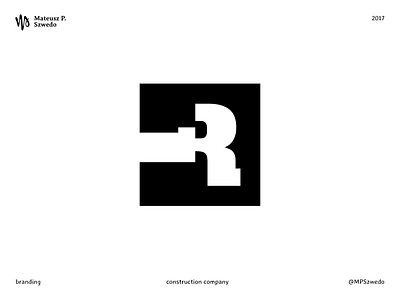
Construction company
Rosso Srl, construction company.
The logo was built starting by the letter “R” (the first letter of the name), which its stem was rotated 90°, transforming the letter into the abstract form of a hammer. The same form was used by the business as a graphic element on the company vehicles, website and letterhead.
(Work made at the communication company E_Factory)
More by Mateusz P. Szwedo View profile
Like
