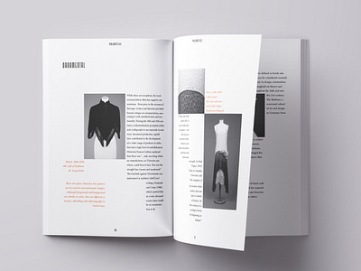
Exhibition Catalogue Spread
This is just one spread of many designed for a exhibition called "Polarities". The booklet had to be done in black and white with the exception of one color allowed to be used in text only. I chose to use a 6 vertical grid system to separate the text in a dynamic yet still legible way. The red is used to highlight image descriptions.
More by michaela View profile
Like
