DailyUI #045 - Info Card
Good' evening Dribbblers 👋
This is my #45 #DailyUI design. 🌲🏞️🐻
Design Hint 💻
No design hint today... I assume to design something to do with information cards.
The Idea 💡
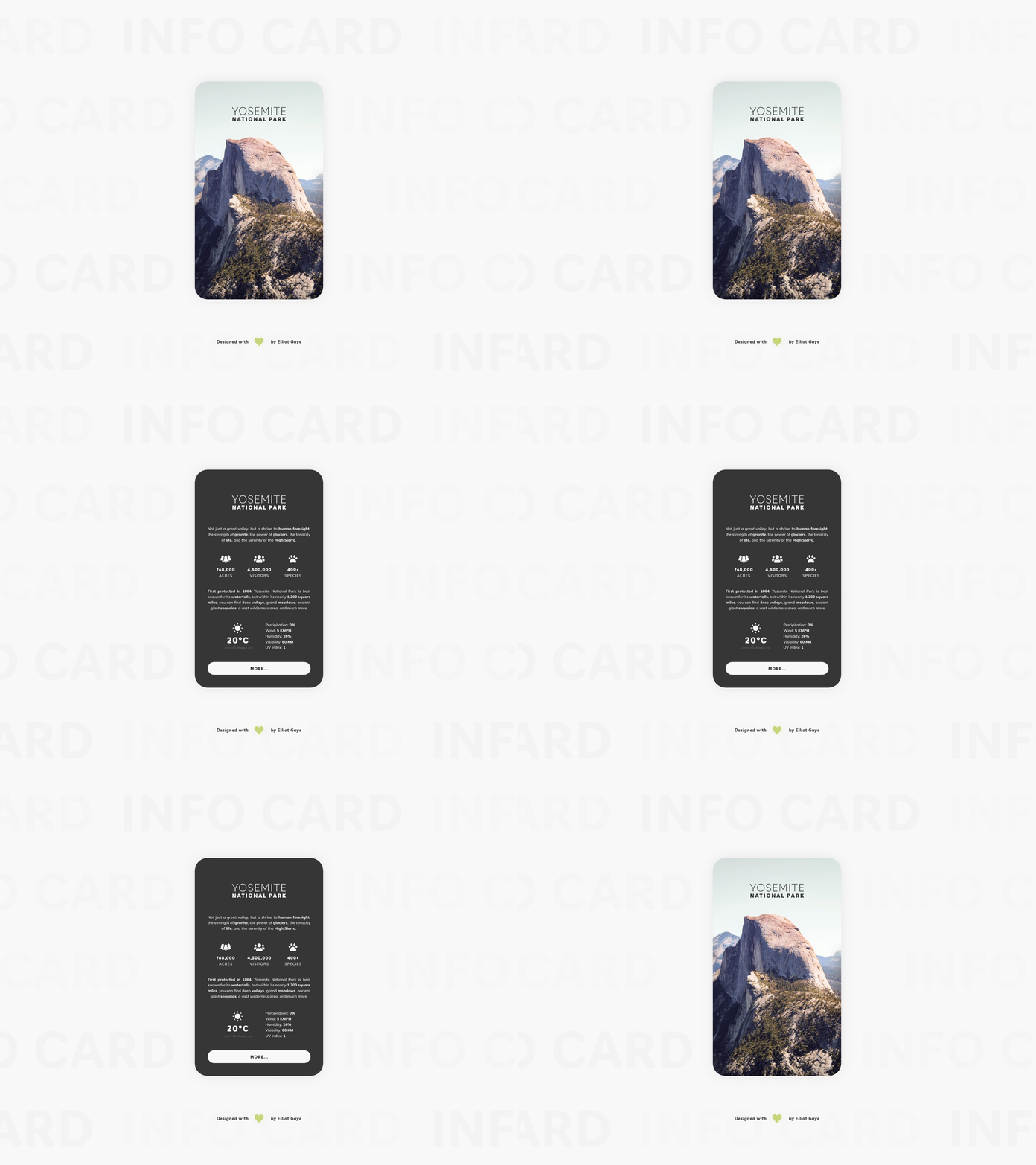
The idea for today’s UI design is a simple informational snippet card that would be used as part of various national parks websites. Specifically, I will be basing all my information within todays design about the Yosemite National Park in California, US. The card will feature various snippets of major information (such as how big the park is, how many visitors it has and what species call it home), along with the current weather statistics for the park, to further let the user gain more useful information. The design will feature a prominent photograph of the park on the front of the card, while the back will be occupying a dark themed colour palette to display the various informational snippets.
Final Thoughts 🧠
It's pretty sleek! Balanced between simplicity, minimalism and the right amount of information; exactly what an info card should be! I love what I've achieved today!
The animation still falls prey to the GIF creation, making it look 'slugglish', as what I described about yesterday's DailyUI, although not as sluggish as yesterdays since the animation is not as complicated.
Now to the thought process. The user would 'hover' over the card with their cursor within the browser, this would then 'flip' the card to view the information on the back side of it. What the user would see on the back side would first be the title of the park in a simple, yet stylish typographic way. The user would then see various short paragraphs describing the park at it's most basic level, to let the user gain some insight into what the park is etc. Following, is some medium-sized 'information snippets', displaying how many acres the park covers, how many annual visitors the park gains and how many species of animal call the park it's home, all while using iconography to ease the user into the information. Finally, an informational weather snippet for the current weather at the park finishes of the card, giving the user insight into the current temperature, precipitation, wind speed, humidity, visibility and UV level. Once the user has finished reading the card, they can either 'hover' back off the card to let it display the front side again, or click the 'more' button to load up the parks dedicated web page, for more information.
Overall, it's been a chill day of designing and animating my information card for day 45 of my DailyUI challenge. I love what I've designed today and I think it does look pretty sleek! Props to the photographer for the photograph displayed within this UI, I couldn't stop looking at the beautiful scenic views of Yosemite!
Unsplash photo credits 📷
@jasonhogan
Share the love, press "L" or "F" if you ❤️ my work!
As always, I welcome any feedback! 😄
- Elliot
