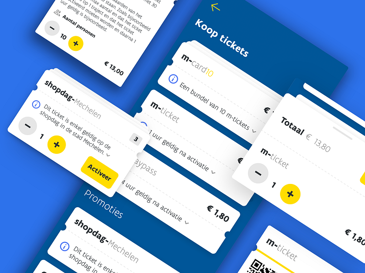
Public transport - Ticket design (De Lijn)
I've done quite a few iterations to redesign the ticket section of the mobile app while working for De Lijn. It was very inconsistent and could use some improvements to enhance the user experience and improve the conversion while still being clean, clear and consistent.
The showcased design was made by understanding various user needs and frustrations which we gathered and researched and has been validated (and further optimized) based on feedback from our beta testers.
Want to see it live?
🍎 iOS | https://apps.apple.com/be/app/de-lijn/id456910787?l=nl
🤖 Android | https://play.google.com/store/apps/details?id=com.themobilecompany.delijn&hl=en
If you like what you see, don't hesitate to follow me ;) I'll be posting more about my work for the Belgium public transport companies and various other experiments! 🎉
