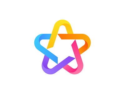
Star 3 | Logo Exploration
Hey guys,
Here's another star exploration from my recent project. This time I decided to create the logo using gradients. I used the same color palette as the previous one because, in my opinion, these colors fit amazing with this logo. In the coming days I will explore different colors, so stay tunned.
Feedback is welcome!
Need help with your future logo?
I'm currently available for new projects!
More by Victor Murea View profile
Like

