Elements App Icon
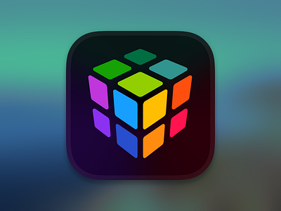
Here's the app icon I designed for the app we are currently working on: Elements.
Elements is a structured financial planning system that helps advisors analyze the 'elements' of a client's financial health.
Originally, there were 12 elements of financial health, so this icon pays homage to those 12 founding elements, each being represented by a different color. The color, like teal for Savings, is also reflected in the Savings section of the app.
The main UI of the app is dark, which is why we chose to go with a dark background. Initially, we chose a dark gray to black gradient, but found it to be hard to see if the user's phone had a black wallpaper. The solution was to have an angular gradient behind the cube that almost makes the cube appear to glow.
The playful nature of the cube icon is intentional. Taking care of your financial health is a lot like eating your vegetables. You know it's good for you, but you don't enjoy doing it. We wanted our app to feel friendly and approachable.
I'd love y'all's feedback. Thanks.