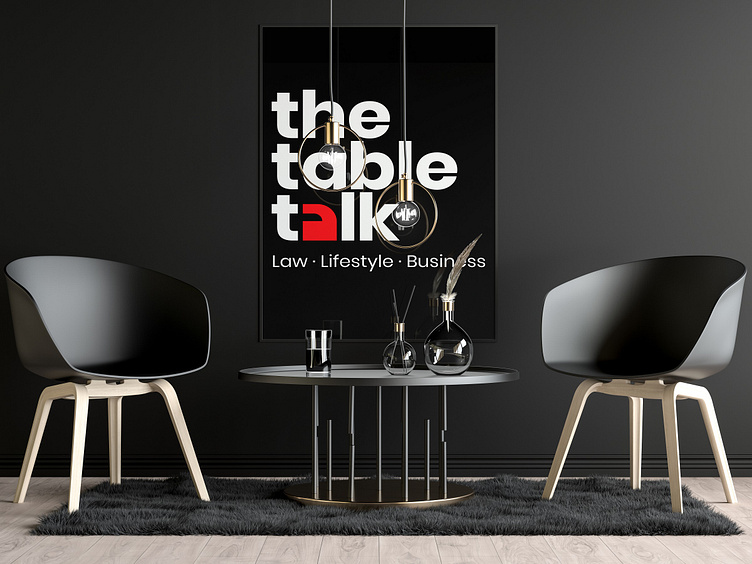
The Table Talk Logo
Going through the brand purpose of thetabletalk™, I discovered that the it’s core method of causing change is to spark conversations on various issues as they affect individuals and the society at large. This was why I chose the quotation mark as the core element of its logo.
Quotation marks, also known as quotes, quote marks, speech marks, inverted commas, or talking marks, are punctuation marks used in pairs in various writing systems to set off direct speech, a quotation, or a phrase. The pair consists of an opening quotation mark and a closing quotation mark, which may or may not be the same character. (Wikipedia)
Quotation marks are used to set off and represent exact language (either spoken or written) that has come from somebody else. (Purdue University)
The Wordmark: I decided to go for a word mark because of legibility considering that this logo will be displayed on screen most of the time. Lowercase text was adopted to portray a friendly, young and approachable brand. The letters in the logo have tight leading and tracking to illustrate inclusiveness.
Colours: The colour red was chosen because of the energy and passion that it radiates which is synonymous with thetabletalk™’s purpose of causing change in the society. Black and white was chosen for power and purity respectively.
