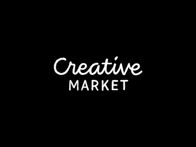
Logotype Redraw #4 — Creative Market
The last time Creative Market update their logo was 2016, and it kinda shows its age now. The lettering feels old.
The direction I'm going for here is being creative means being natural. So I'm giving the logo a natural treatment with textured type, with a hint of fun to it.
This natural texture look can be translated to more complete branding material with icons and illustration using the same texture style.
This is a part of ongoing series I started recently to practice my lettering by redrawing existing logotypes.
Let me know what you think on the comments 💌 or if you have any request which logotype should I redraw next 🎯
More by Laurensius Adi View profile
Like

