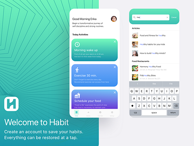
Heuristic Rule 05 - Habit Apps
Continue to share my knowledge about UI design guideline from
Nielsen and Molich’s 10 general principles for interaction design.
Heuristics Rule Number 5
“Error Prevention”
----------------------------------------------------
Even better than good error messages is a careful design which prevents a problem from occurring in the first place. Either eliminate error-prone conditions or check for them and present users with a confirmation option before they commit to the action.
In other words. As the saying goes, 'prevention is better than cure'; systems should be designed to limit the scope for user error, rather than try to find 'best fixes'. All highlighted interfaces on this post are how this rule is implemented in interface design.
When conducting a Heuristic Evaluation on interface design that is intended to find usability problems at heuristic point number 5, Error Prevention.
I usually make a question like the following:
1. Are there design restrictions that can prevent a user from making a mistake?
2. Does the user guide have suggestions for preventing wrong actions?
3.Is there auto correction when the user makes a mistake with the system?
Feel free for leaving your comments, constructive feedback is welcome. 🙏
Don't forget to share some ♥️ with this design
uxmarker was founded with one mission mind: creating the best and most reliable user-centered design for our clients. Here in our HQ, we deal with a wide range of design avenues on every product platform. To ensure a satisfying product experience, our dedicated team generate data from curated user research methods and analyse them to find and fix various design obstacles. With our ingenious ideas and tested skill, we believe we can help make your products a pleasure to workwith.
We are available for projects, hit us up at hello@uxmarker.com
Instagram || Medium || Shop at UI8


