Sprocket Make Offer Bttn Pictograph Optimization
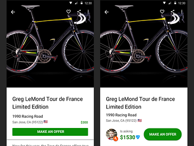
I've been receiving a lot of feedback through my bicycle feedback customer support system that are actually offers to buy Sprocket App sale items.
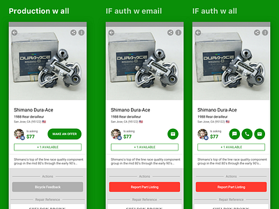
My hypothesis is that people who want to ask a question and not necessarily make the offer ( or those who dont read English well ) are attempting to use the report button at the bottom or in the upper right corner to contact seller.
I turned the text button into individual pictographic buttons that glance-ably give feedback on what contact methods are available, without having to know English and without setting up a context for how they should or should not be used. I also turned the report button red and made the text more clear
What do you think?
If you like it, don't hesitate to click "L" 💗 or "F".
Sprocket Bicycle App on Android
Sprocket Bicycle App on iOS
Sprocket Bicycle Blog on Instagram
Sprocket Bicycle Blog on Tumblr
Sprocket Bicycle Blog on FB