Chase Dashboard UI Redesign
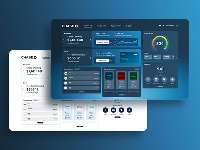
For my third and most ambitious UI project yet, I’ve redesigned the Chase Bank customer dashboard. As a frequent user of Chase’s dashboard, I was inspired to see how I could improve it to provide a better user experience. With more prominent buttons, pleasing typefaces and rounded corners, the redesign lets users access their most important banking features more easily. Added features include a line graph of available funds, a subscriptions tab, and an immediate view of the user’s credit score and its factors. Accompanying a redesign of the bank’s traditional light color scheme is a dark mode, and users can switch between the two in their settings.
Contact: griffin@hellion.org
