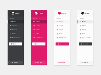
Side Navs for Reviewr
We've been busy building Reviewr and I wanted to spend some time redoing the side navigation so that we can tie it into Tailwind CSS which we're using to build the app.
So here are some of the early concepts, I do have another version too but I'll keep that for sharing later and it's just the accent colour of our visual identity which is just nuts 🥜🔩
Anyway, since you're here reading this I might as well tell you about Reviewr. Cough cough, sales pitch coming 🙈😂
So after years of performing UX audits (Heuristic evaluations, UX reviews, etc etc 🙄) for clients, we decided to create an app to do them quicker.
And we call that app Reviewr, to help us audit websites and apps in less time. And wait, the best thing is it generates beautiful reports - that you can brand - for sharing with clients.
Soon you'll be able to audit websites and apps in no time, saving you hours if not days of work - and hopefully, a few 💰💰💰too!
Head over to Reviewr to sign up for early access.
Oh yeah, please show some love and like the shot ❤️
